


As an Aquarius, my ideal birth month color palette apparently leans cool, calm, and a little ethereal – but when Benjamin Moore’s January birth-month colors popped up on my feed, I wasn’t expecting to be so swayed by its garnet tones.
What caught my eye wasn’t just the richness of their chosen birth month colors, but the combination itself: a deep burgundy red paired with a dark, velvety plum purple, and a warm neutral to liven up the mix. But while burgundy and purple are two hues I’ve long loved independently, I’d never once thought to bring them together.
What intrigued me the most about this unexpected color combination is how it goes against the color rules many of us follow when decorating.
We rarely see tones like Pomegranate and Caponata given equal airtime in one scheme. Burgundy paint is often used in earthy palettes as a grounding color – warm, familiar, and traditional – while plum tends to be treated as a trending accent, brought in through smaller hits of color. Benjamin Moore’s palette challenges that entirely, allowing both shades to sit alongside one another.
Together, they create a layered richness that feels particularly well-suited to winter – enveloping, comforting, and full of the character we’re craving in the glum January weather.


Benjamin Moore
Caponata, AF-650

Benjamin Moore
Pomegranate, AF-295

Benjamin Moore
Woodland Snow, 2161-70
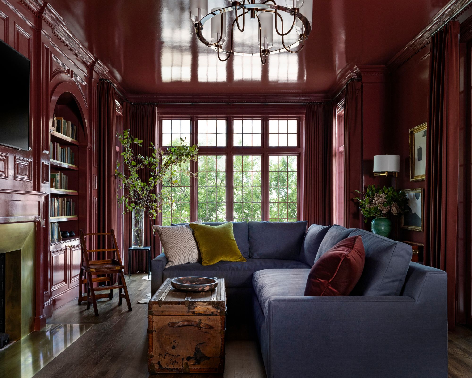

(Image credit: Marie Flanigan Interiors, photography Julie Soefer)
What really makes this palette feel considered rather than dark and overwhelming is the inclusion of a soft neutral: Woodland Snow.
Sitting alongside the burgundy and plum, it lifts the scheme and gives the deeper tones space to breathe. Rather than diluting the richness, however, the orange-based neutral adds to the warmth, allowing both colors to feel more at home.
If you’re brave enough to go bold, this is a palette that works well with confidence. Color-drenching a room in a glossy burgundy, like in this enveloping home library by Marie Flanigan, seen above, will create a grown-up and luxurious feel. Introduce some plum-toned throw pillows or even paint an accent window, door, or trim for added contrast and a double drenching effect.
Dialled back, the palette works just as beautifully in reverse through accents. Think warm neutral walls with a large plum-toned rug to anchor the scheme and some wine-red textiles to invigorate a neutral couch to help you experiment without too much commitment.
So, while it’s not a color combination I ever would have arrived at on my own, that’s exactly why it’s stayed with me. And perhaps that’s the appeal of birth-month colorsin the first place: they invite you to try something unexpected yet deeply personal.
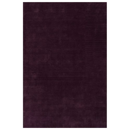
Wayfair
Arrel Speckled Wool-Blend Area Rug
While a purple rug might sound rather daunting, a single saturated rug is one of the top rug trends for 2026 for creating the coolest home. This one is understated yet full of depth, made from wool and viscose for a subtle sheen.
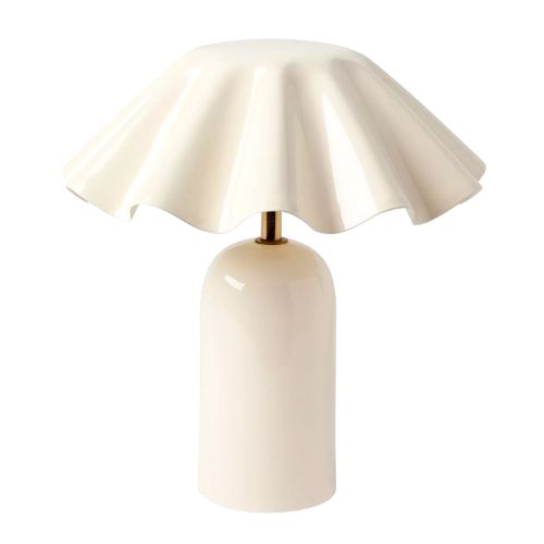
Serena & Lily
Brooks Fluted Cordless Table Lamp
Have you jumped on the portable lamp trend yet? If not, where have you been? Perfect for adding extra ambiance to any corner (with no need for wires), plus you can create a statement with color or shape, like this sweet fluted design.
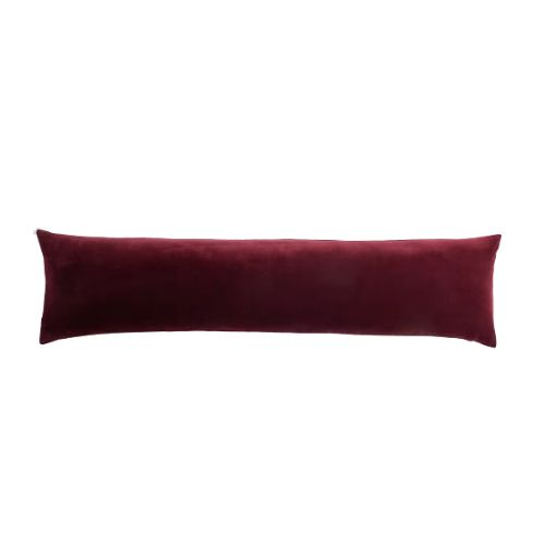
Quince
Cotton Velvet Oversized Lumbar Pillow Cover
Upgrade plain white sheets or a neutral couch with an on-trend oversized lumbar pillow in one bold tone. This wine red velvet will instantly add a sense of richness and polish, as well as provide a focal point upon entry to your space.
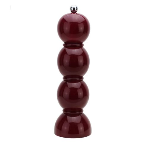
Addison Ross
Cherry Bobbin Salt or Pepper Mill
Pops of colors are absolutely welcome in the kitchen, and one of my favorite ways to do this is with small yet beautiful accents like this deep cherry lacquered salt mill. The bobbin shape adds to the whimsy and creates a real conversation starter at the table.
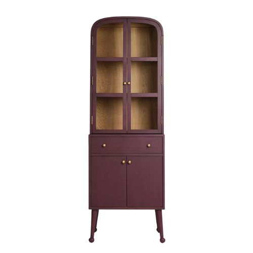
AnthroHome
Moretti Oak Bar Cabinet
Anthropologie are masters at elevating even the most boring of furniture pieces, like functional storage. This slender dining room cabinet not only has plenty of space, a striking shape, and ball feet, but also comes in this lovely earthy plum hue.
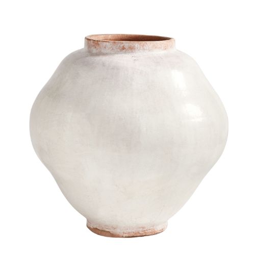
Pottery Barn
Glazed Handcrafted Terracotta Vases
Handcrafted in the Philippines using terracotta and finished with a glaze and a crackle finish, this rustic vase combines neutral tones while allowing the natural orange hue of the terracotta shine through.
Benjamin Moore’s rich January color palette is a reminder that sometimes the most successful color schemes come from unexpected places. Whether you embrace the palette in full or in smaller doses, it offers a whimsical starting point for choosing a color scheme for your home that feels personal and just a little outside of the box.
link