Futurama Animators Have A Specific Name For The Show’s Unique Color Scheme

We may receive a commission on purchases made from links.
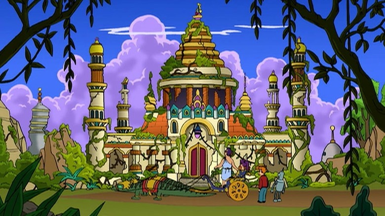
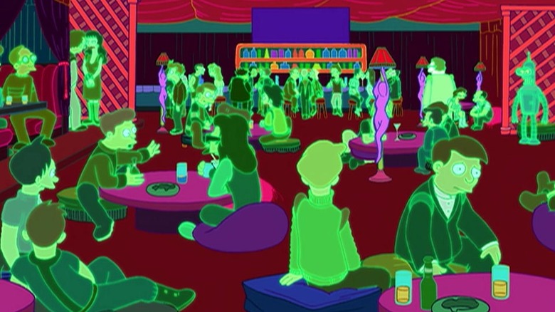
The first Emmy that “Futurama” ever won came in 2000 for the episode “A Bicyclops Built for Two” (March 19). The award was for Outstanding Individual Achievement in Animation for Color Styling. That episode took place largely on a distant planet, seemingly occupied by the last of a species of humanoid cyclopes. The planet was suffused with interesting greens, purples, and other attractive alien flora snaking through the cyclops’ ruined marble mansions. This was preceded by a sequence wherein the show’s main characters all project virtual avatars into a VR internet where the backgrounds were all deep indigo, and everyone was outlined in neon green. The colors, overseen by the show’s color supervisor Samantha Harrison, are indeed dazzling.
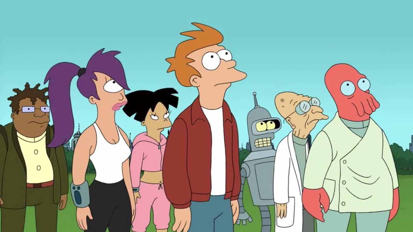
The colors on “Futurama” have long made it a unique series. There are a lot of brick reds, all surrounding a lime/cyan starship. Indeed, there are plenty of cyans, aquas, and gentle pastel greens throughout the show, from the Professor’s slippers to the face of Kif Kroker. These are offset by the red of Fry’s jacket, the masonry of the Planet Express building, and the deep pink of the lobster man Dr. Zoidberg. Because green and red are spectrally opposite, they stand out, making for an appealing yet striking aesthetic.
In the new book “The Art of Futurama,” the show’s various makers explain that the deliberate color scheme of “Futurama” has a name, given by Harrison herself. The show doesn’t bank in primary colors; there aren’t a lot of bright reds, blues, or yellows. And it doesn’t really bank on secondary colors either. The term Harrison invented was “saturated tertiaries.”
The color scheme for Futurama was named saturated tertiaries
Director Rich Moore was impressed with Harrison’s Emmy-winning work, and he recalled asking her if she had a term for the types of colors she was selecting. He said:
“I asked the color stylist, Samantha Harrison, if they had a name for the look of the color on Futurama. She called it ‘saturated tertiaries,’ meaning it’s mostly not primary colors, like red, yellow, or blue, And It’s not secondary colors, like green, orange, and purple. Tertiaries are this kind of gold or olive or taupe color, that often are described as neutral. You’ll usually see them as a soft bed that other colors rest on. But in Futurama, Samantha wants those to be the highlight colors, the main colors, so she saturates them.”
Which is certainly novel. The background colors are now the foreground colors. Moore loved it, continuing: “It’s these great tertiary colors that are just pumped. This is what gives the show it’s unique look that’s recognizable as ‘Futurama.'” No other show shares the “Futurama” color scheme. And “Futurama,” in always visiting new planets, meeting new aliens, and hopping off to alternate dimensions, constantly needs to innovate with its colors.
Harrison also gave an extended comment, noting that color schemes were difficult in animation because the images are all flat. One needed to separate the foreground characters from the backgrounds without the colors bleeding into one another; the cold gray Bender, for instance, shouldn’t be seen against similarly gray backgrounds. It was a unique challenge.
Samantha Harrison faced unique challenges when making Futurama
Harrison said that she required a Photoshop artist on her team to add certain kinds of colorful gradations, and even then, she doesn’t seem pleased with the results, as the images are always, in her word, flat. Harrison said:
“Color-wise, the way the show looks is really flat with no gradations. For instance, when the Planet Express ship crashes into the Space Beehive, there are yellows on yellows within the dripping honey. There’s a gradation there with color, but it’s completely flat. Each shape is flat. At the very end of the process a Photoshop artist comes in, and they would have added the gradations that are happening there. The one going into the honeycomb is a very soft gradation, but everything else is completely flat.”
That’s a reference to the episode “The Sting” (June 1, 2003), which did indeed feature a gigantic space beehive, complete with massive alien bumblebees. The colorists had to treat every frame essentially like a giant coloring book, filling in each shape drawn by a hard black line. There’s no texture or watercolor-like washes in such an animated universe. The most visual texture Harrison could bring is to add those gradations within each individual shape.
It may be flat, but it’s still very striking, and the show stands out as a result, resembling both classic hand-painted TV animation, but also modern CGI adventures. There’s a very good reason Harrison won that Emmy.
link


