The biggest color trends of 2024
Nothing transforms a space like color. A wonderful mood enhancer, it has the power to change the look and feel of a space instantly. While ultimately color is a very personal thing and it’s important to surround yourself with the shades you love, it’s a good idea to familiarize yourself with the current color trends before embarking on a project to ensure your space feels fresh and relevant. The color wheel is also a great tool used by interior designers for palette scheming and working out what shades work in harmony together.
Whether you’re planning a home redesign or looking to update a tired room, we’ve consulted the color experts and rounded up the paint trend forecasts to bring you a comprehensive guide to the stand-out shades for interiors in 2024.
What are the biggest color trends of 2024?
(Image credit: Farrow & Ball)
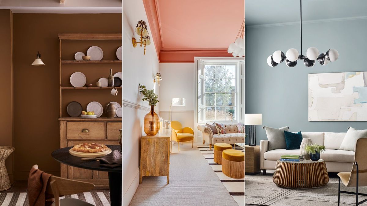
According to color experts and trend forecasters warm, earthy tones such as brown, caramel and beige are tipped to be the top color trends in interiors for 2024, alongside pretty plaster pinks and sunbaked peachy tones. Warm and grounding, these trending colors follow our desire to create calming and comforting spaces.
‘2024 has seen a move towards indulgent cocooning interiors that deliver a soothing power, be that rich and indulgent browns and mid-tone caramels which create cozy comforting schemes, or warm and versatile neutrals such as the ochre toned ‘Galette’ or warm stone hue ‘Split Pink’,’ says Ruth Mottershead, creative director at Little Greene.
Tash Bradley, director of interior design and color psychologist at Lick echoes the prediction that earthy neutrals will continue to captivate this year. ‘In 2024 we are going to see people celebrating color in a more contemporary way. Grey-based neutrals are being swapped for warmer, yellow-based neutrals. Enduring and timeless, and subtle and soothing, they pair beautifully with the fresher, more vibrant colors, creating a sense of balance and harmony.’
However, on the other end of the spectrum, cool, calming colors are also having a moment, with the soft greens and blues of nature coming to the fore to satisfy our desire for nourishing yet uplifting spaces to soothe the soul.
‘While we predict that natural, grounding earth tones will continue to form the anchor of interior color palettes in 2024 and beyond, we also anticipate that these will be paired with brighter, zestier, more uplifting colors that reflect a new-found energy, optimism and desire to have fun with our interiors,’ adds Tash Bradley.
(Image credit: Beige 02, Lick)
Meanwhile, those more confident with color will be pleased to hear that vibrant reds, yellows and bold mid-blues are also proving popular within interior design with the warm mid-blue Blue Nova selected as Benjamin Moore’s color of the year for 2024. The color experts at Sherwin-Williams have also reported a rise in the popularity of richer tones and have tipped its rich forest green Billiard Room to be a stand-out shade.
‘While neutrals like beige and grey have been a safe choice for many years, 2024 is seeing a slight dip in their relevance. While neutrals are still popular top sellers, their market share is being diluted by the evolving consumer desire for deeper and richer colors in their living spaces. The data indicates a growing enthusiasm for colors that make a statement, moving away from the safety of neutrals,’ says Clare’s founder & CEO, Nicole Gibbons.
Below we reveal the key color and paint trends guaranteed to get you inspired.
1. Warming cocao hues
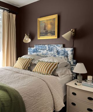
(Image credit: Walls in Coffee Date by Clare paints, photograph @kfogara)
Warm, cocooning and grounding, earthy browns are rising in popularity as homeowners seek to surround themselves with comforting color. Surprisingly versatile, decorating with brown works beautifully with other earthy tones like olive greens and terracotta, plus brown pairs brilliantly with pale pinks. Alternatively, team it with blue for a more uplifting feel.
‘Shades of brown have seen sales increase by an astonishing 452.3% from 2022 to 2023. This resurgence is led by shades like the rich, chocolatey Coffee Date, the nutty Dirty Chai, and the latte-inspired Turbinado,’ says Nicole Gibbons, founder & CEO at Clare. ‘These colors are not just popular; they are revolutionizing the way we think about interior spaces, bringing a sense of warmth and earthiness that has been long overlooked.’
2. Captivating caramel tones
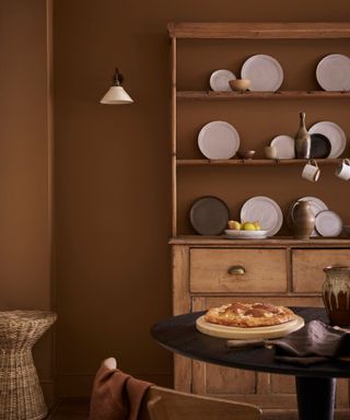
(Image credit: Walls in Galette, Little Greene)
Just as chocolate browns are making a return, so too are irresistible caramel tones. Once shunned for being dated, these golden hues are proving irresistible with interior designers and we’re seeing them paired with richer browns, warm white paints, soft pinks and blues.
‘Richer neutrals are overtaking whites in popularity, bringing with them a cozy and inviting atmosphere. These earthy yet refined shades make them the perfect backdrop to the natural materials currently being incorporated in contemporary interiors, including wicker, rattan, warm woods, and stone finishes,’ says Ruth Mottershead.

Ruth Mottershead, creative & marketing director of Little Greene and Paint & Paper Library, has been working in her family’s business since 2011. She began her creative career as a Landscape Architect, designing outdoor public spaces. When the opportunity arose to join her father and brother at Little Greene, it felt like a natural transition, tapping into the close relationship between exterior/spatial design and interior design.
3. Peachy hues
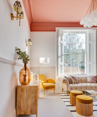
(Image credit: Ceiling in LICK RED 03, Douglas Bridge Photography)
Since Pantone announced Peach Fuzz as its Color of the Year for 2024 we’re noticing it everywhere. Described by the institute’s vice president Laurie Pressman as ‘a compassionate and nurturing soft peach shade whose heartfelt kindness and all-embracing spirit enriches mind, body, and soul,’ the shade has been embraced by the interiors world and features in many trending paint palettes.
Lick’s 2024 palette celebrates peachy tones with the inclusion of its dusky Red 03 and Orange 05 shades. ‘Both colors stimulate, energize, and spark conversation. When introduced as accent colors in a home, they create a focal talking point, lending themselves particularly well to ceilings,’ says Tash Bradley.
In addition to color trends, experts are also spotting trends in the way colors are used and increasingly seeing people embrace playful colors on ceilings.
‘The ceiling is now being recognized as a key element within a design scheme, often the largest expanse of color you will see in a room, it can transform how a room will feel,’ says Ruth Mottershead, creative director and marketing director at Little Greene. ‘Painting your ceilings is a great way to finish off the look of a room and create instant impact. Rather than opting for the habitual bright white, consumers are painting ceilings in tonal colors that coordinate with wallpapers or wall colors for a cohesive color-drenched look.’
4. Blissful blues
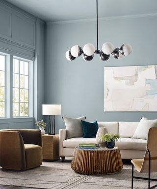
(Image credit: Walls in Stardew by Sherwin Williams)
Several paint brands and trend forecasters are championing pale blues this year. Soothing, versatile and fresh, they work well in myriad spaces and pair wonderfully with on-trend sunset hues on the opposite side of the color wheel, too.
‘Nature-inspired colors have become the most popular shades for homeowners since 2020 – in the first half of the decade green was really taking over, but now blues have joined the mix. Light blues especially, since we believe that coastal chic will be the new ‘it’ trend in the coming year, and this shade, when paired with darker blues, creamy whites and wooden accents, creates that perfect beachy aesthetic,’ says Emily Kantz, color marketing manager at Sherwin-Williams.
With this in mind, the color experts at Sherwin Williams have selected the tranquil Stardew SW 9138 as one of its trending shades for 2024. ‘This distinctive and dreamy slate blue holds a trace of magic in its bewitching balance of warm and cool undertones,’ adds Emily Kantz. ‘Blues and greens, especially lighter ones like this shade, are great to use in respite rooms like bedrooms for their association with calmness and rest. I recommend pairing them with either a lighter shade of blue like Mountain Air SW 6224 or a contrasting deep orange-red like Coral Clay SW 9005.’
Cool light blue also features in Behr’s trending palette in the form of Offshore Mist. ‘Offshore Mist, is a soft blue hue that evokes a feeling of calm and therefore pairs nicely in spaces designated for unwinding like a kitchen, bedroom, or bathroom,’ says Erika Woelfel, VP of color and creative services at Behr. ‘For an unexpected pairing, use Offshore Mist with Cracked Pepper as the contrasting shades hues make for a dynamic look. The soft blue also works nicely with light neutrals in the white family like Whipped Cream.’
5. Plaster pinks
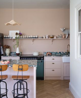
(Image credit: Walls in Setting Plaster by Farrow & Ball, photograph James Merrell)
Plaster pinks see no sign of abating this year; warm, feminine and versatile they bring subtle color and softness while keeping spaces feeling bright. Perfect for kitchens to bedrooms, they pair beautifully with olive greens, browns and charcoal grey, or try creating a fun contrast with pops of zesty yellow or red.
‘Earthy pinks, such as Pink Ground and Setting Plaster, have been doing the rounds for a few years now and for good reason,’ says Patrick O’Donnell, brand ambassador at Farrow & Ball. ‘Consider them as neutral and they will layer with almost any color and will work in any room in your home. They make the most flattering wall color for your bathroom as well as a calming choice for a kitchen scheme. These colors are your best friends.’
6. Grounding neutrals
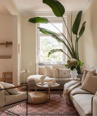
(Image credit: Living room in Lick White 05, photograph @homeinheidelberg)
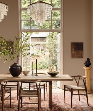
Decorating with neutrals, including warm taupe, beige and stoney hues remains a strong paint trend for 2024. Indeed it seems designers and homeowners are far from being bored of beige, as it continues to feature heavily in the color palettes for 2024. Paint company Lick announced Beige 02, Beige 03 and its warm White 05 as key shades in its 2024 palette.
‘In 2024 we are going to see people celebrating color in a more contemporary way. Grey-based neutrals are being swapped for warmer, yellow-based neutrals. Enduring and timeless, and subtle and soothing, they pair beautifully with the fresher, more vibrant colors in our palette, creating a sense of balance and harmony.’ says Tash Bradley.
‘Grounding neutrals, like beige, are timeless and will stand the test of time in comparison to brighter, accent colors. One word that keeps coming up time and time again among my clients is ‘cozy’, and earthy, warm beiges are great for providing a warm and assured space that feels grounded and comfortable, which is why they’re so popular. Lick’s Beige 02 and Beige 03 are so sought after among my clients, and colors people go back to.’
While neutrals are nothing new, experts are noticing them being used in fresh ways. ‘This spring, I’m seeing people becoming much braver with color, and pairing beige with pops of bright primary colors like vibrant acid yellow, lovely lime green, bright oranges and an accent red – which I’m loving,’ adds Tash. ‘Lick’s 2024 color palette is the perfect inspiration for this color combination.’

Tash Bradley
Director of interior design and color psychologist at home décor brand Lick, Tash Bradley uses her expertise in color psychology and theory to help people around the world find the colors that will positively impact their spaces, lifestyle and wellbeing.
7. Embrace the greens and blues of nature
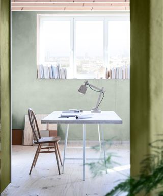
(Image credit: Dulux)
Soft greens and greeny blues reminiscent of sea and sky are timeless shades that never really go out of style, but they’re forecast to be particularly popular this year. A celebration of nature’s healing powers, Dulux’s Calm palette – one of its Color Futures trends for 2024 – brings together a curated array of nature-inspired colors from the gentle Horizon View and Serene Waters to the deeper tones of Neptune Seas and the Nordic Hills, offset with the most delicate of pinks, Sweet Embrace, its Color of the Year for 2024.
‘It’s in the great outdoors where we feel at our most tranquil and by bringing these colors into our homes, we benefit from the same calming effects of being in nature’ says creative director at Dulux, Marianne Shillingford. ‘These are also receding colors with shorter visual wavelengths, so they appear further away and make rooms appear bigger and more spacious than they really are, which is perfect if you want to feel less hemmed in at home.’
‘Rooms with plenty of natural or controllable light in which you want to feel relaxed and peaceful like bedrooms, studies, and bathrooms benefit from the gentle blues and greens in the Calm palette,’ adds Marianne on decorating with green and blue. ‘North facing rooms and rooms in which you want to feel cozy and comforted like bedrooms and living rooms benefit from colors in the Warm palette.’
8. Happy sunshine shades
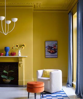
(Image credit: Benjamin Moore)
Vibrant yellows are set to be big this year and are bringing much-needed positivity into our homes in unsettling times. Whether color-drenched or used as an accent in a neutral scheme, decorating with yellow is guaranteed to put a spring in your step.
‘As the brightest color of the visible spectrum, yellow is the most uplifting and refreshing of them all – for the ultimate endorphin boost, embrace all yellow walls and woodwork in a full-on color drench look that envelopes you in a sunshine glow,’ says Helen Shaw, director of marketing (International) at Benjamin Moore. ‘Opt for an accent color that sits opposite on the color wheel to add instant invigoration, this is called a complementary scheme. This combination of yellow and blue is a really pleasing aesthetic. The juxtaposition between the calming cobalt and cheery ‘Sun Valley’ yellow creates a balanced yet dramatic scheme.’
9. Head-turning reds
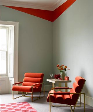
(Image credit: Benjamin Moore)
Following the emergence of the unexpected red theory, pops of vibrant crimson, berry, flame and orange shades are tipped to be popular trend in interiors. Red can be comforting and cocooning used on walls and works particularly well for creating an intimate mood in dining rooms. However, red rooms can be overpowering, and some argue it can even promote feelings of anger. Alternatively, decorating with red in small doses is an effective way to bring life to an otherwise neutral scheme or to highlight architectural features.
‘Classic red paint is confident and charismatic, rich and sensuous. Even in small doses, red is a great statement color and can make an impressive impact in an otherwise uninspiring space. For example, use masking tape to play with angles and introduce unexpected geometry to a corner, creating your own modern take on coving in a fearless, eye-catching color such as red. Pair with furniture and accessories in the same shade to lock the scheme together,’ suggests Helen Shaw, director of marketing (International) at Benjamin Moore.
Paint company Mylands have also forecast red to be a trending color this year, selecting its Huguenot™ No.49 as its stand-out shade for 2024. ‘Nothing captures the essence of drama and sophistication quite like the allure of red. Introducing unexpected hints of red into your home not only elevates the aesthetic but infuses a sense of joy and energy,’ says CEO Dominic Myland.
‘Whether it is a subtle trim detailing, a touch of color inside a shelf or a fully drenched room, red becomes the visual force that draws attention and sparks conversation. Incorporating a deeper red like Huguenot™ No. 49 into a design scheme lends to a warm and calm space. This rich paint has incredibly alluring darkness and depth, with undertones of orange and magenta that combine to create a layered shade that stands out in any space.’
10. Dark, dramatic shades
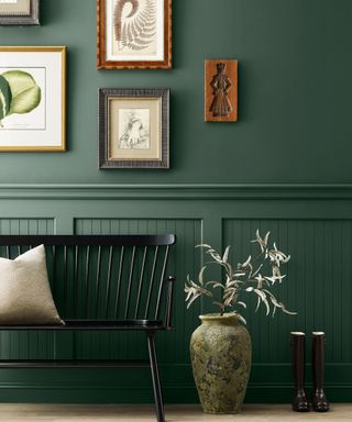
(Image credit: Walls in Billiard Room, Sherwin Williams)
While neutrals and pastels are certainly on trend this year, there’s still an appetite for dark, dramatic colors. The team at Sherwin-Williams selected Tricorn Black SW 6258 and Billiard Green SW 0016 as key shades in their trending palettes for 2024.
Moody colors like this are trending at the moment for many reasons – one of them being the uncertain times we’re living in, which tend to make dark shades more popular,’ says Emily Kantz, color marketing manager at Sherwin-Williams.
‘This lush dark green shade is an earthy and nature-inspired shade that evokes calmness and sophistication into a space. Greens have taken over as the most popular shade since 2020 due to homeowners wanting their interiors to feel more like nature, and this shade does just that. For a fresh bold look, I recommend pairing with a pop of zest like Chartreuse SW 0073, in a space like a powder room or a hallway,’ adds Emily.
link


