The Top Kitchen Paint Color Trends of 2025, According to Experts

You don’t need a therapist, they said, you need a newly painted kitchen. And you, in your post-pandemic flight of fancy, hopped on that trend bandwagon with hasty zest, giving your kitchen a Barbie pink-on-pink-on-pink color wash that would make Greta Gerwig proud. But now, a year in, you’ve had to live in this pink hellscape and you’re slowly descending into madness. That’s why designers in 2025 are rethinking kitchens with longevity (and sanity) in mind.
“It’s less about bold, attention-grabbing shades and more about crafting an ambience that feels calming and timeless,” says ELLE DECOR A-List architect Hannes Peer, who was recently inspired by a Mark Rothko exhibition in Paris, where he saw powerful color combinations that, as he put it, “felt almost eternal.”
How does that translate to kitchens? “We’re seeing a more comforting but nuanced take on color,” says Hannah Yeo, Benjamin Moore’s color marketing guru. “There is still a strong interest in embracing color, but the colors that feel most relevant have a sense of ease and adaptability.” Yeo calls out the brand’s color of the year, Cinnamon Slate, a delicate mix of heathered plum and velvety brown that is tonally ambiguous.
U.K.-based designer Nicola Harding says she’s seeing what she calls “in-between colors” everywhere across the pond—and she’s here for it. “Is it pink or is it brown? Is it cream or is it yellow? It’s not purple, it’s not mustard,” she observes. “These colors, in particular, prick my interest. They are less obvious…and they drive a sense of curiosity.”
While muted tones and rich hues are cropping up across the design universe with impressive staying power, we aren’t fully ready to walk away from our love of all things retro, it seems. The interior design world has been drunk on disco fever for the past year, with the hashtag #discodecor amassing 38 million views on TikTok since fall 2024, paving the way for what Etsy trend expert Dayna Isom Johnson is calling a Chrome-mas. What does this have to do with kitchens? Pinterest mood boards are rife with kitchens doused in colors that complement this cool metallic. “Shoppers are going nuts over warm neutrals like taupe, as well as rich earth tones like rust and deep olive,” Isom Johnson explains. “These combinations merge warmth and sophistication with a modern edge.”
In the same vein as the unexpected red trend, Isom Johnson is betting that we’ll take that ethos one step further in our cooking spaces next year. “There will also be a shift toward using color on unexpected surfaces, like countertops, accent walls, and even fixtures,” she explains. “Smaller design elements—such as open shelving, barstools, and even tile backsplashes—offer a great way to add pops of color.”
Ready to talk color shop? Below, we’ve tapped the crème de la crème of color forecasters and interior designers for insight into what paint colors are poised to shape modern kitchens in 2025 and far beyond, from rich reds to earthy wood tones to custard yellows. Finally, you can retire your paintbrush and meet your forever kitchen.
Oxblood Red
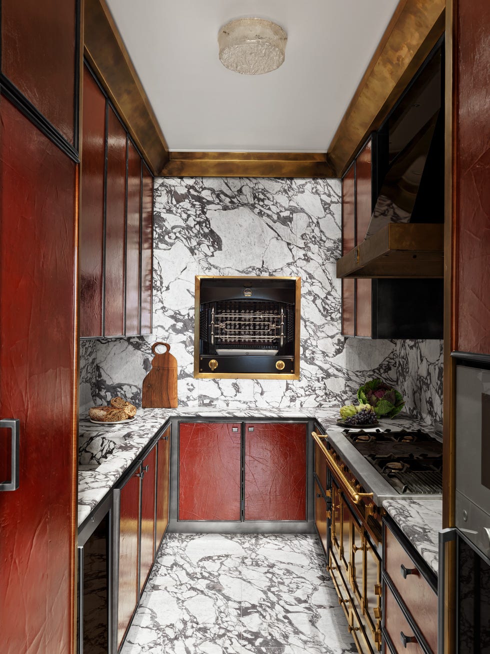
A red kitchen doesn’t have to scream with the boldness of Paolo Castellarin and Didier Bonnin’s color-saturated, fire-engine red universe (though we love that they went there). Instead, a more muted, sophisticated tone can transform the space into something warm, inviting, and exude a sense of understated luxury. These deeper, subdued reds—like shades of crimson, burgundy, and oxblood—are on high demand in the paint world, according to Joa Studholme, Farrow & Ball’s color curator. “We are generally looking at earth tones in the kitchen, so clay shades or deep greens that connect us with the earth and reflect the peace and tranquility of nature while adding a flourish to our homes that has an old school feel,” Studholme says. Studholme predicts that the U.K.-based paint company’s deep clay tone Etruscan Red will spotlight in many a kitchen next year, which Studholme says, “feels luxurious and atmospheric on a central island with warm neutral Stirabout on walls and Jitney on cabinets.”
Plum Purple
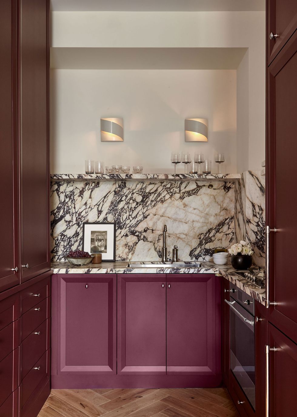
Purple is having a moment in the design world. As this year’s COTY announcements trickled in, it became clear that we’re poised for a bona fide purple fest: with Minwax’s Violet, GLIDDEN Paint by PPG’s Purple Basil, Benjamin Moore’s Cinnamon Slate (which is really just a muddied purple), and Behr’s ruby red Rumors (infused with can’t-be-missed purple undertones). It’s simply a matter of time before these trending colors find their way into the kitchen decor arena. With its rich, dusky hue, a muted plum purple adds depth and warmth to the kitchen, creating a space that feels both inviting and unique. Muted plum evokes a sense of luxury without being overpowering, creating an environment that’s subtly bold yet calming and adds a touch of drama without overwhelming the room’s ambience.
When incorporating this hue into your home, Emily Kantz, Sherwin-Williams’s color marketing manager says these muted tones lend themselves well to a color drenching opportunity. “I see these deeper colors being used primarily as the cabinet color and even as the corresponding wall color to give that immersive color experience that we have seen gain popularity over the past few years in color drenching,” she explains. “We have also seen these deeper shades paired with wallcoverings to add in a dose of pattern and personality.”
Earthy Tones
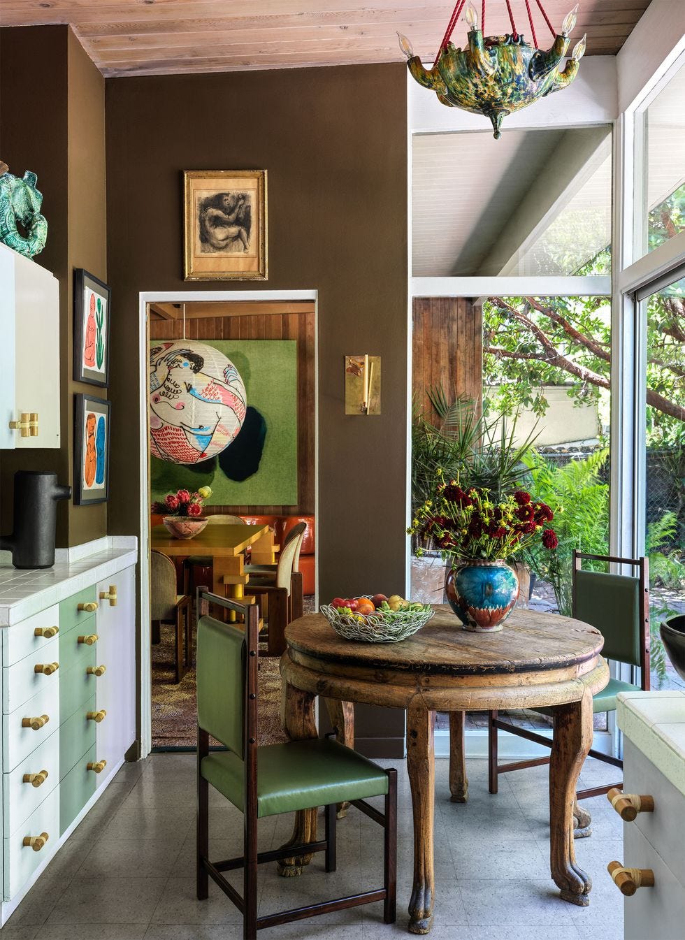
Trends are cyclical, and deep earth tones, it seems, are continually ripe for a comeback—or are they simply timeless? “We’ve seen natural wood cabinetry and flooring take over kitchen design this past year, and people are gravitating towards authentic wood tones that bring that innate warmth into the space especially the kitchen which is the main hub of the home,” says Kantz. “People are moving towards colors and materials that bring comfort and that enhance natural materials such as marble, granite, and quartzite.”
We practically have an “amen” from ELLE DECOR A-list designer Christine Gachot. “Chocolate brown takes the cake,” she holds, adding that earthy browns are the firm’s It color of the year. “Call it Caramel, Cinnamon, or Camel—the warmth of a tawny brown defines our Gachot Palette DNA, bringing an earthy sophistication to any space. This deep hue is both timeless and refreshingly modern, providing a grounding presence that resonates throughout the room.”
An earthy wood-tone kitchen brings the outside in, blending simplicity and elegance in a way that feels modern, but with a deep-rooted connection to the natural world. When using it in the kitchen, Gachot recommends highlighting this hue with a soft blush to create a delicate balance between warmth and freshness or, for a bolder statement, pair it with deep jewel tones to enhance its luxurious quality. “This shade serves as a canvas for both subtle elegance and bold statements, offering versatility that feels at once familiar and refreshingly new,” she adds.
Deep Olive Green
The very ’70s avocado green kitchen had its comeback moment for one hot minute—and now we’re moving on. According to Farrow & Ball’s Studholme, that means turning the dial way down on the color wheel, with deep greens kitchens poised to be all the rage next year. “We are generally looking at earth tones in the kitchen, so deep greens that connect us with the earth and reflect the peace and tranquility of nature while adding a flourish to our homes which has an old school feel,” she explains, noting that Farrow & Ball’s classic Studio Green is a fan favorite for cabinets as of late. “It reads almost as black but with some extra subtle character, feels reassuring and sophisticated,” she adds.
As people seek environments that promote well-being and serenity, Yeo of Benjamin Moore says designers are increasingly drawn to this sophisticated hue. “Green hues have staying power with their flexibility, appearing rich, calming or refreshing,” she says. “These colors beautifully highlight the millwork on cabinets and trim, and instantly create a wonderfully moody kitchen, perfect for hosting.”
Muted Yellow
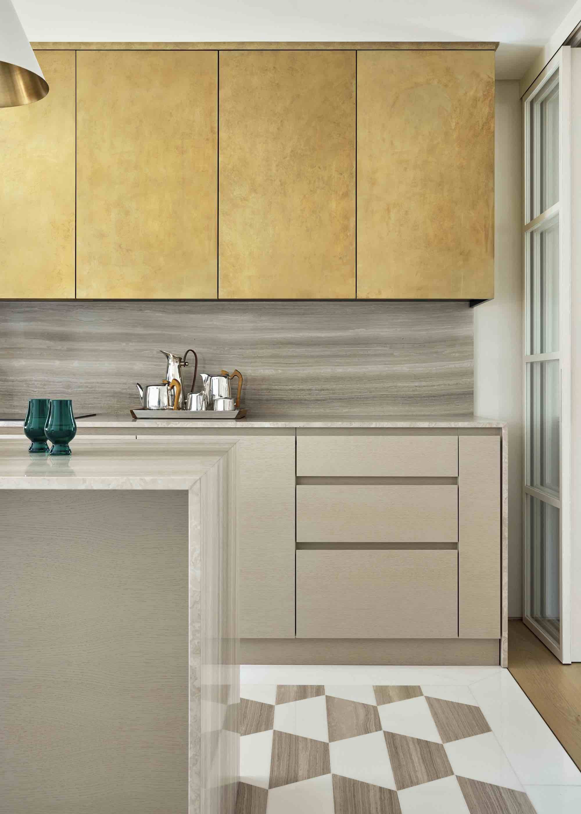
In 2025, yellow is poised to be a big hit in kitchens. But it won’t be the yellow you think you know. A tonally ambiguous yellow could have undertones of greens, grays, and even blues. It might appear more like chartreuse or a desaturated gold. Harding’s favorite rendition of this hue is what she calls custard, a brownish yellow that she has observed appear in English gardens. “Nature is so clever, she creates a palette that works with our murky British skies,” the designer explains. “The light we have here is subtler and more gentle than other places, so we get these softer, muted tones as a result.”
When incorporating this into the kitchen space, Harding likes to paint joinery in this hue for contrast. “To keep that tonal approach and get away from it feeling blocky, I’ll break it up with different in-between shades to create soft, subtle contrasts,” she explains.
Rachel Silva is the associate digital editor at ELLE DECOR, where she covers all things design, architecture, and lifestyle. She also oversees the publication’s feature article coverage, and is, at any moment, knee-deep in an investigation on everything from the to the on the internet right now. She has more than 12 years of experience in editorial, working as a photo assignment editor at Time and acting as the president of Women in Media in NYC. She went to Columbia Journalism School, and her work has been nominated for awards from ASME, the Society of Publication Designers, and World Press Photo.
link



:max_bytes(150000):strip_icc()/GettyImages-544347092-69d2e73c38f345a7baa16f89d6570186.jpg)
