
Color Schemes for the Global Wind Atlas

The Global Wind Atlas is a series of maps that identify high-wind areas for wind power generation. There are three maps in the series (Wind Speed, Wind Power Density, and Wind Capacity Factor) and they are all available in ArcGIS Living Atlas. If you are interested to know more about the Global Wind Atlas layers and how they can be used to assess global wind potential to support green energy development, see the Explore the Global Wind Atlas StoryMap.
Developing a set of informative color schemes for dynamic layers can be a cartographic challenge. This blog is about the methods we used for mixing colors along with some techniques to make it easy to repeat the process on your own series of maps.
Here are the three layers with their final color schemes:
Wind Speed 100 meters around Chengdu and Chongquing, China.

Wind Power Density 150 meters in part of the Appalachian Mountains in southwest Virginia, USA.

Wind Capacity Factor IEC1 in Europe around the Mediterranean Sea.

Creating a Theme
Color selection unlocks the data’s story and for scientific data it is necessary to display the full spectrum of information without bias. The colors chosen and where emphasis gets placed affects your viewers’ ability to interpret and make decisions about what is mapped.
The wind layers are image services made from raster data, so we used an equal interval continuous color scheme to display minimum and maximum values. Equal intervals with definitive color stops allow viewers to understand things as a percentage of a whole, so there are color changes at 0, 25, 50, 75, and 100%. The goal was to look at the color scheme and quickly organize what the colors represent (for example, this color is twice as much as that one).
To make them feel like a set, we chose colors where all three layers start with a variation of dark blue for the low values, the middle values for each layer have unique but similar color combinations, and the highest values all display in yellow.

However, an added challenge is these layers are multidimensional image services, which means the entire range of the data needs to be accounted for, not just what’s presented in one selected dimension. Here’s an example showing Wind Power Density around the Horn of Africa. You can see when you change the height, it first starts with dark blue all over the map but then the orange and yellow values increase and the map looks completely different.

Selecting Colors
The schemes were developed in ArcGIS Pro using the HSV Color Mode. HSV is an additive color mode made up of hue (H), saturation (S), and value (V) or brightness. You can finesse colors with precision using HSV and this is the mode I develop colors in the most.

When developing the color schemes, we were careful selecting the yellow color for maximum values so they didn’t dominate the map. Perfect yellow has a hue of 60° and can have a strong presence, so all three yellows are slightly moving towards orange in the 40-50° range.
Additionally, we kept the saturation low between 19-38% for all the schemes so the yellows stayed closer to white but with just a hint of color. For value we wanted real illumination against the opposite dark blue, so the colors are fully bright at 98-100%.
What was tricky was making sure the windy poles didn’t get over emphasized. Both Greenland in the north and the southernmost tip of South America naturally have more wind but don’t have a large network of transmission infrastructure. In addition, fewer people live there and there is less demand for wind energy. We didn’t want these locations to be overemphasized.
We tested these areas over and over until we had the right colors for yellow, as described above, with our goal being you might see them at first, because they are the brightest, but they prompt you to explore the rest of the map instead of focusing your attention on one place.

What makes these schemes unique from each other are the colors from 50–75%. We wanted an element of intensity, so we went with colors like purple, red, orange, and gold. We optimized these colors so the multidimensions within the data could accentuate a variety of geographies. Using Wind Capacity Factor IEC 1 as an example, here in Brazil you can see the red and gold hues really stand out from the blue and purple. At 25% and 50% all of the schemes have colors that are high in saturation and are complimentary on the color wheel (for example here it’s not a huge leap to go from periwinkle to an orange-red).

The last part of the color schemes are the dark blue values. Dark maps do a good job of being the backdrop for data that has a diverse geography and a massive range. Unlike a light background which can dominate by being bright, a dark background disappears and allows even the most minimum values of wind dynamics to be seen.

We did adjust the Maximum Values
One last note, the raw multidimensional image services come symbolized with the minimum and maximum value by default. Using Wind Speed as an example, that meant the range was 0-84.66 meters per second. Having it set that high meant we weren’t able to see the full spectrum of information because the outliers were skewing the color scheme. You can change this in ArcGIS Pro and Online so we modified the maximum value to 12 meters per second which is considered the speed at which most turbines can produce their maximum power. Here along the border of Nepal and Tibet watch how to modify that in ArcGIS Online.

Interesting Geography
These layers are a valuable addition to the Living Atlas. They can be used globally for renewable energy planning, climate research, or environmental impact assessments. They also are fascinating to explore. There are so many unique wind patterns across the earth to discover.
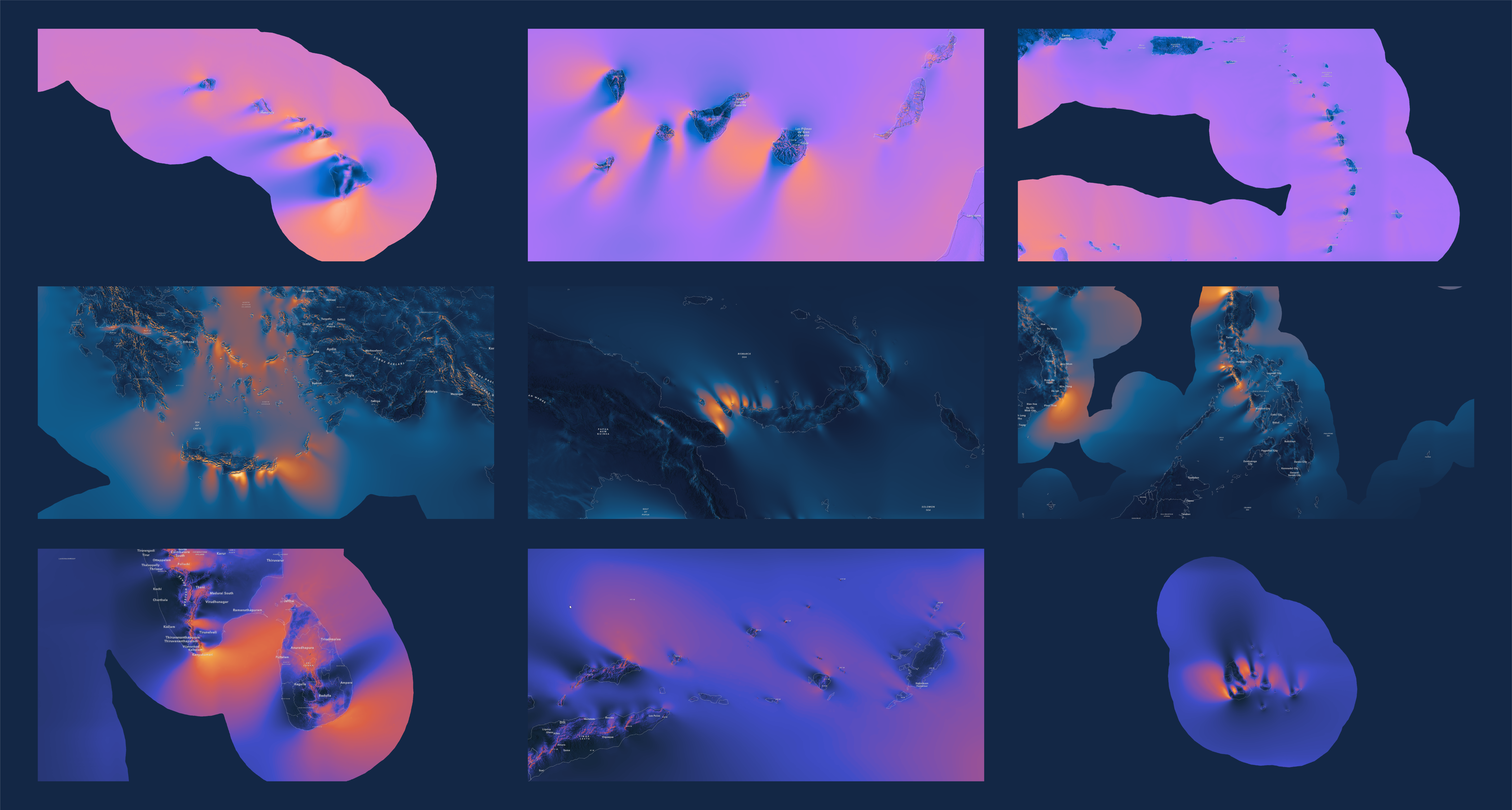
For example, we saw interesting wind arrangements around islands areas like here where the wind patterns cast shadows, much in the same way light does.
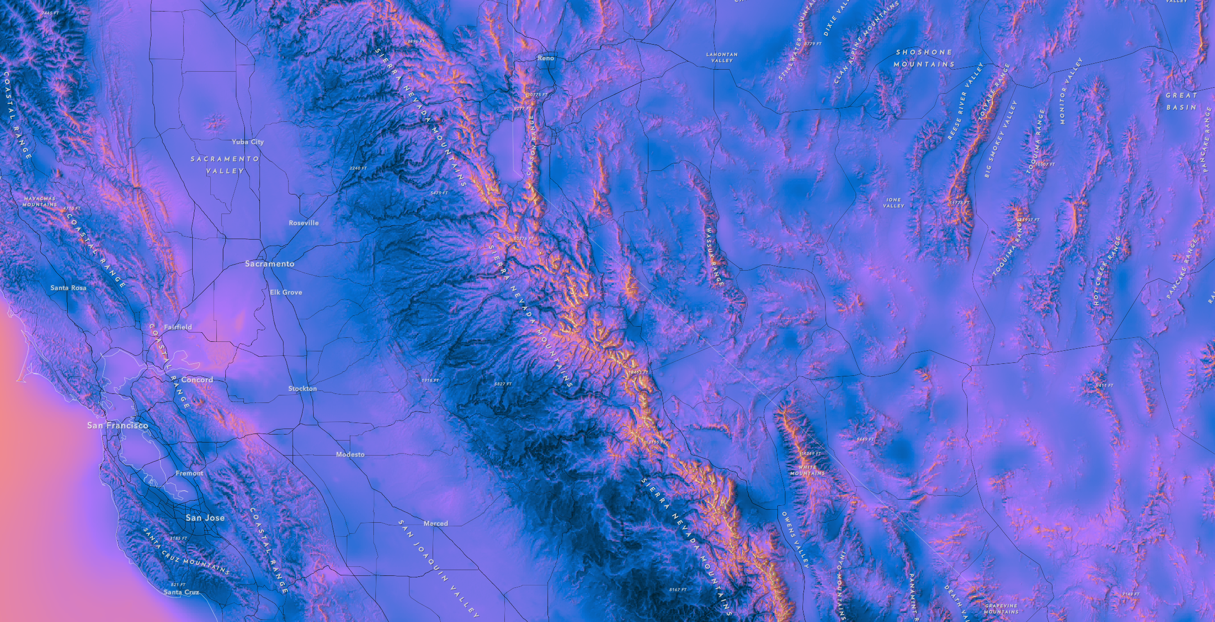
The Sierra Crest is the spine of California. It runs roughly north-to-south and demarcates the western and eastern slopes of the Sierra Nevada. This example shows Wind Speeds up to 100 meters. The highest granite peaks are easily discerned.
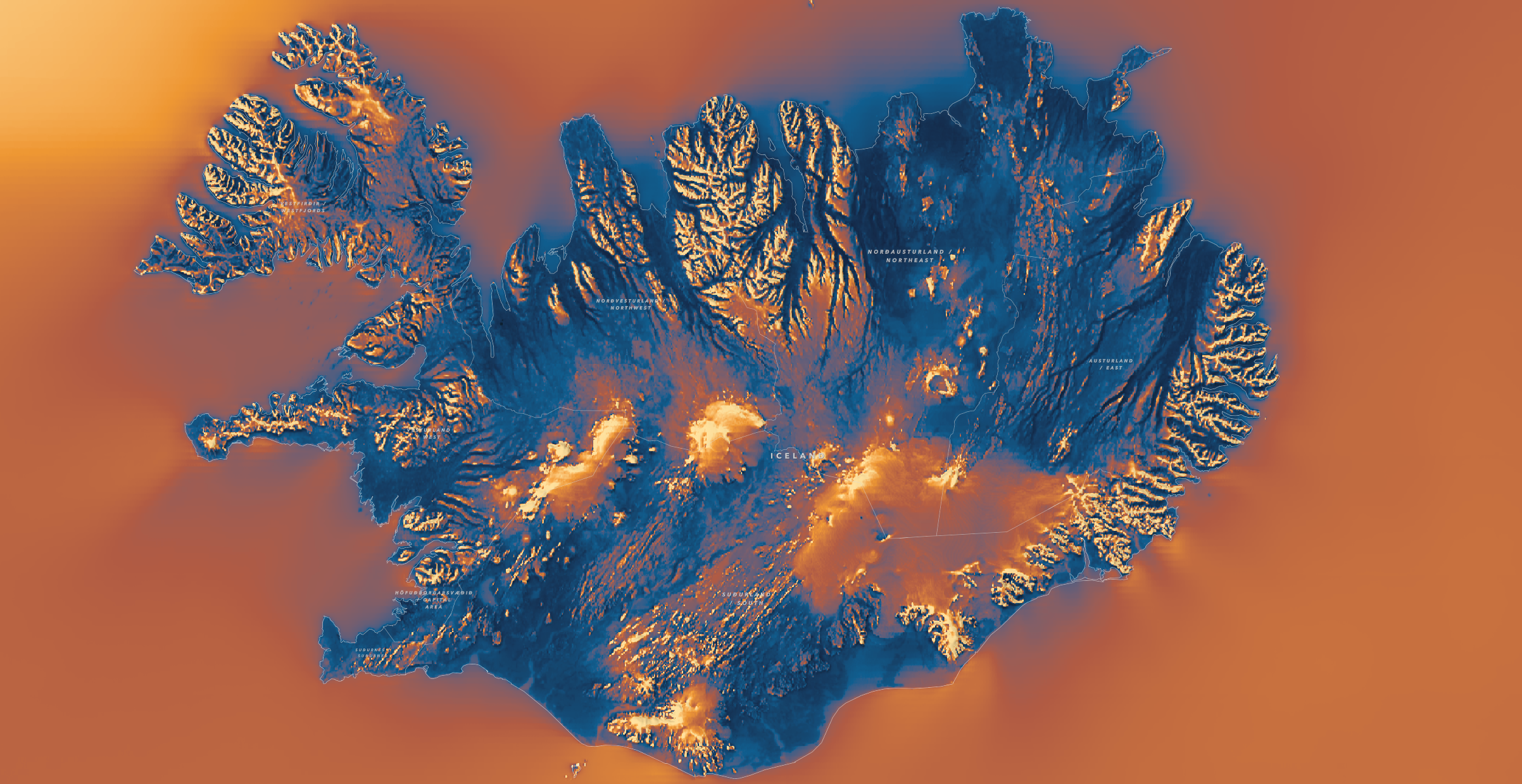
In Iceland in the center and southern part of the country you can see katabatic winds coming off Snæfellsjökull, Langjökull, Hoffellsjökull, Vatnajokull, and Mýrdalsjökull glaciers with the Wind Power Density 10 meters layer.
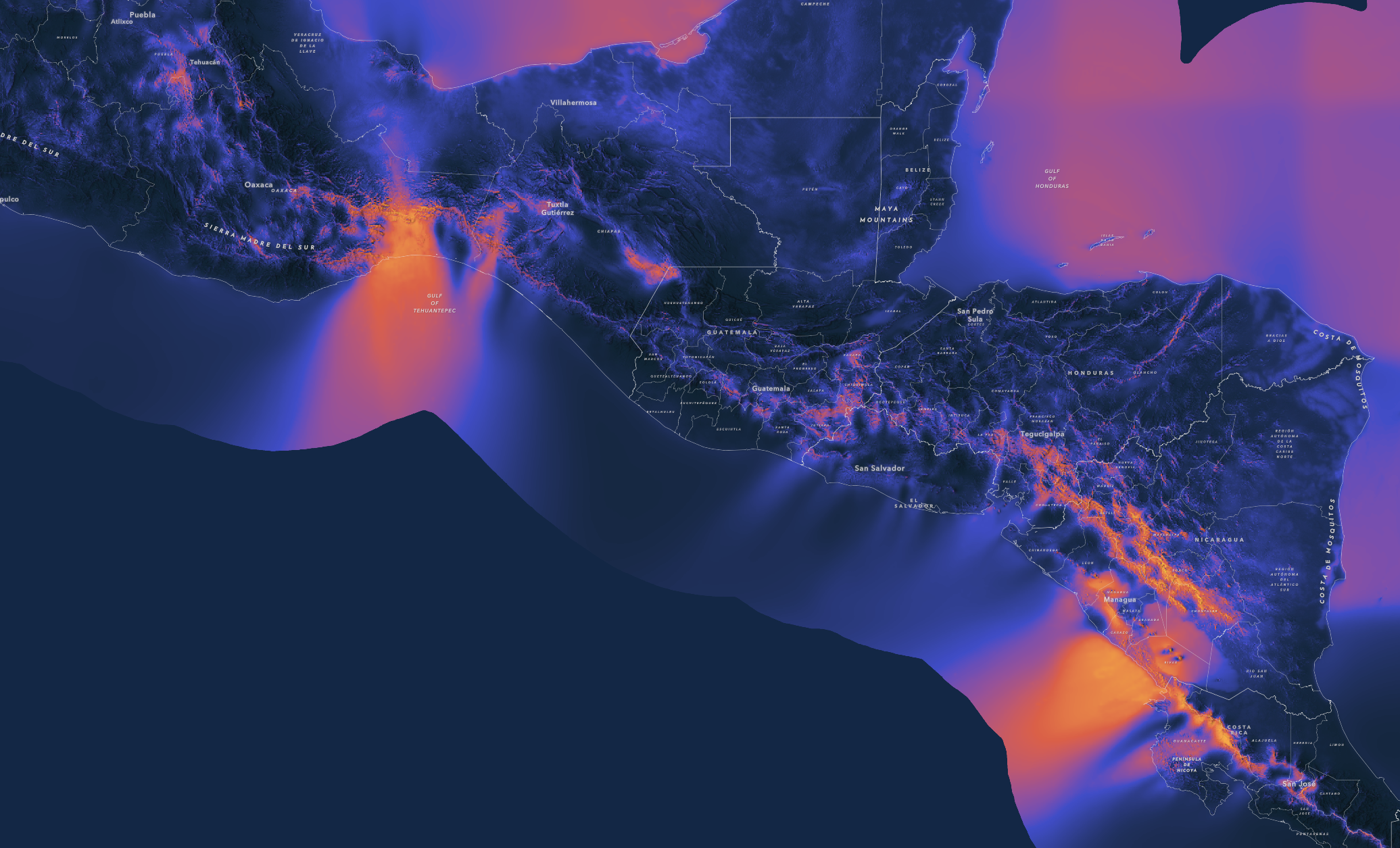
In Central America there are two distinct wind patterns you can see on this map of Wind Capacity Factor IEC 1. In Mexico the Tehuano Wind travels through the Chivela Pass across the Isthmus of Tehuantepec. In Nicaragua, the Papagayo Wind travels from the Caribbean Sea through the low elevation areas of Lake Nicaragua.
Explore the Maps
There are so many discoveries to be made about the dynamic relationship between land and wind and how it can be used to generate clean energy.
To go directly to the three layers visit the ArcGIS Living Atlas. Also check out the Explore the Global Wind Atlas StoryMap.
If you would like the webmaps used in this blog along with a custom basemap they can be found here:
Global Wind Atlas – Wind Speed
Global Wind Atlas – Power Density
Global Wind Atlas – Capacity Factor
Please reach out with comments or questions.
link


