
Historic Home Guides Kitchen Design

COLUMBUS, OH — Homeowners are often the voice that designers listen to most closely when it comes to making decisions about a remodel or new-build project. In the case of the renovation of this 1897 home in Grandview, OH, Shannon Tannehill’s clients – both doctors with a child and a shared love of the outdoors – expressed to her that they wanted a relaxing interior that wasn’t too trendy.
“They aren’t frilly or over-the-top kind of people,” relates the UDCP with The Cleary Company in Columbus. “Instead, they are more modest. They wanted something they could love for years, and that stayed cohesive with the original style of the home.
“They were very open to our ideas about how to create their new space,” she continues, noting additional contributions to the project were made by Laura Watson, lead designer; Rob Lindeboom, project manager; Ben Ludlow, lead carpenter, and Luis Gomez, trim carpenter. “They really trusted and relied upon the design process and our expertise.”
With relatively ‘quiet’ homeowners, Tannehill welcomed input from a bit more ‘vocal’ client…the house itself.
“In a not-so-strange way, we considered the home itself to be an additional client,” she explains. “The home is a registered historical site in the city. We didn’t want to lose any of its historic charm, so we used the house to guide us in the right direction. We did have some limitations considering the home’s age, and there were a lot of quirky things that may have made sense more than 100 years ago…but they don’t necessarily today.”
Gaining Light and Square Footage
For example, the powder room took up valuable square footage within the kitchen footprint.
“The powder room was located in the kitchen, and it just felt very awkward to have people walk out of it directly into the kitchen,” she relates. “However, since it’s the only bathroom on the first floor, we couldn’t just eliminate it. We had to relocate it, which was a challenge.”
To accommodate, the design team borrowed some space from the hallway and adjoining family room to create a petite powder room with just enough space for a toilet and sink (see sidebar, below).
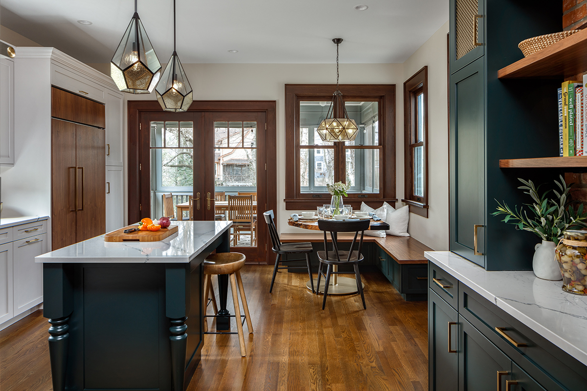
Relocating the bathroom also provided space in the kitchen to incorporate a seating area with a live-edge table, sourced by the client, and an L-shaped walnut bench.
“I love using walnut because of its richness and warmth,” Tannehill remarks. “It has great honey tones mixed with brown and a bit of red. And the graining pattern is always superb!”
Adding a window on the back wall – which offers a glimpse into the screened-in porch – allows much-needed natural light to flow into the space.
“There wasn’t a lot of natural light in the kitchen, so once we removed the powder room we were able to replace the wall with more windows, including an additional window above the sink,” she says.
While adding windows normally isn’t necessarily a difficult undertaking, in this renovation, the design team kept the original windows, which had decorative sashes.
“We didn’t want to change out all of the sashes just because we were adding windows,” Tannehill indicates. “We wanted to build upon what was already there. That meant we were tasked with finding antique sashes that matched the rest of the sashes in the home. Fortunately, we found something similar at a local architectural salvage [Columbus Architectural Salvage]. That search was one of my favorite parts of the project.”
The team was also challenged with matching the original wood trim and moulding, including around the new windows, that ran throughout the whole house.
“When we added the front door, small foyer and new windows, the new trim had to match as closely as possible to the original,” the designer says. “Luis, our trim carpenter, worked his magic to make this happen and it looks like it has always been there.”
Details, Details
That ‘make-it-look-like-it-has-always-been-there’ theme was prevalent throughout the entire project. “We didn’t want to bring in anything too modern, yet we wanted to update it for contemporary living,” she explains.
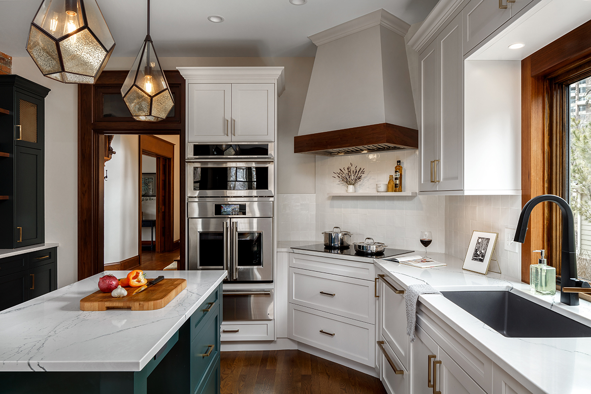
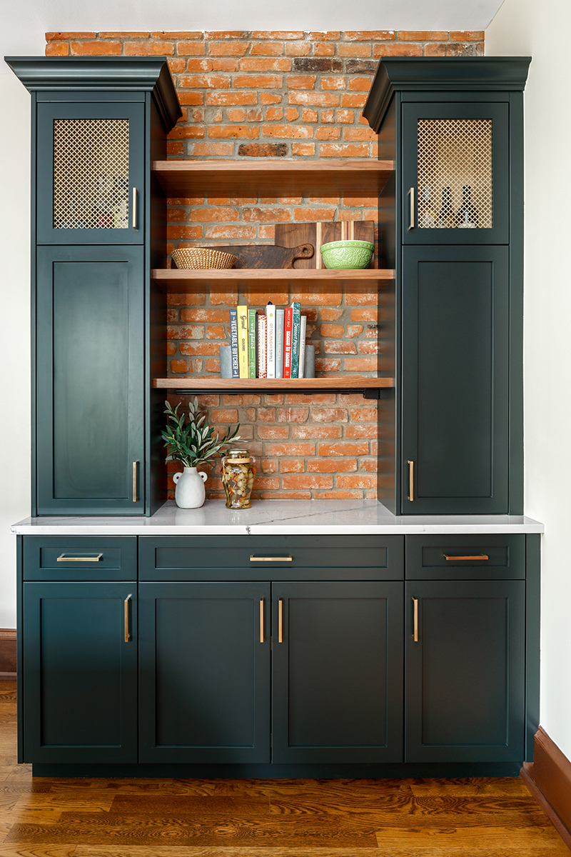
As such, Tannehill maintained the existing exposed brick in the in-kitchen bar/drop zone, which her clients also use to store large pots and pans and charge electronics. The designer complemented it with walnut floating shelves and a quartz countertop fabricated from Cambria’s Gladstone. The uppermost sections of the tall tower cabinets are accented with metal grids, sourced from M-D Building Products, in a cloverleaf design and an Albras finish.
“Metal grids such as these are one of my favorite design elements to use right now,” she says. “They allow you to see what’s inside a cabinet, similar to seeded or clear glass, but they add texture. They are just a different way to break up the expanse of cabinets.”
Tannehill chose to sheath the custom cabinetry with Sherwin Williams’ Jasper paint and accent it with relatively simple Honey Bronze square bar pulls from Top Knobs.
“This color is a bit of a chameleon,” she relates. “When the light shines on it brightly, it leans towards green, but when the lights are turned down, it reads more navy. It’s a good mix of blue and green, and it also brings in a natural element from the outdoors. I consider it a beautiful neutral color.”
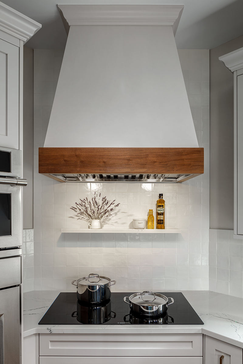
The designer repeated the green/blue hue on the island. She contrasted it with Sherwin Williams’ Pediment for the perimeter cabinetry and panels for the Fisher & Paykel dishwasher drawers, which are positioned next to the Blanco Silgranit Cinder sink accented with a Moen pulldown faucet in Matte Black. The classic bright white paint matches the Marazzi 4″x4″ Gesso zellige tile backsplash. Both paint colors are joined by walnut in the form of panels for the GE Monogram side-by-side refrigerator and as accent trim for the ventilation hood surround above the Bosch induction cooktop. Additional appliances include a built-in GE Monogram oven, speed oven and warming drawer.
The cooktop is sited on an angled wall that couldn’t be eliminated due to existing HVAC/plumbing components.
“Angled corners can be challenging to design around,” Tannehill indicates. “There is usually dead space to either side of anything that is placed along the angle, so we needed to be mindful of making sure we utilized every other square inch of the room. There also isn’t as much space in front of the cabinetry, so we needed to be aware of where we positioned the island. Fortunately, they are a small family so we didn’t need a large island.”
A pair of Antique Bronze Cinq pendants from Progress Lighting hover above the island and complement the four-light Oiled Burnished Bronze pendant ceiling light from Savoy House that illuminates the seating area.
“We wanted to make the lighting soft and neutral with a bit of an antiqued look,” she says. “Clear glass pendants are very pretty, but they can also show dust, so the seeded glass in these fixtures work well in the space.” ▪
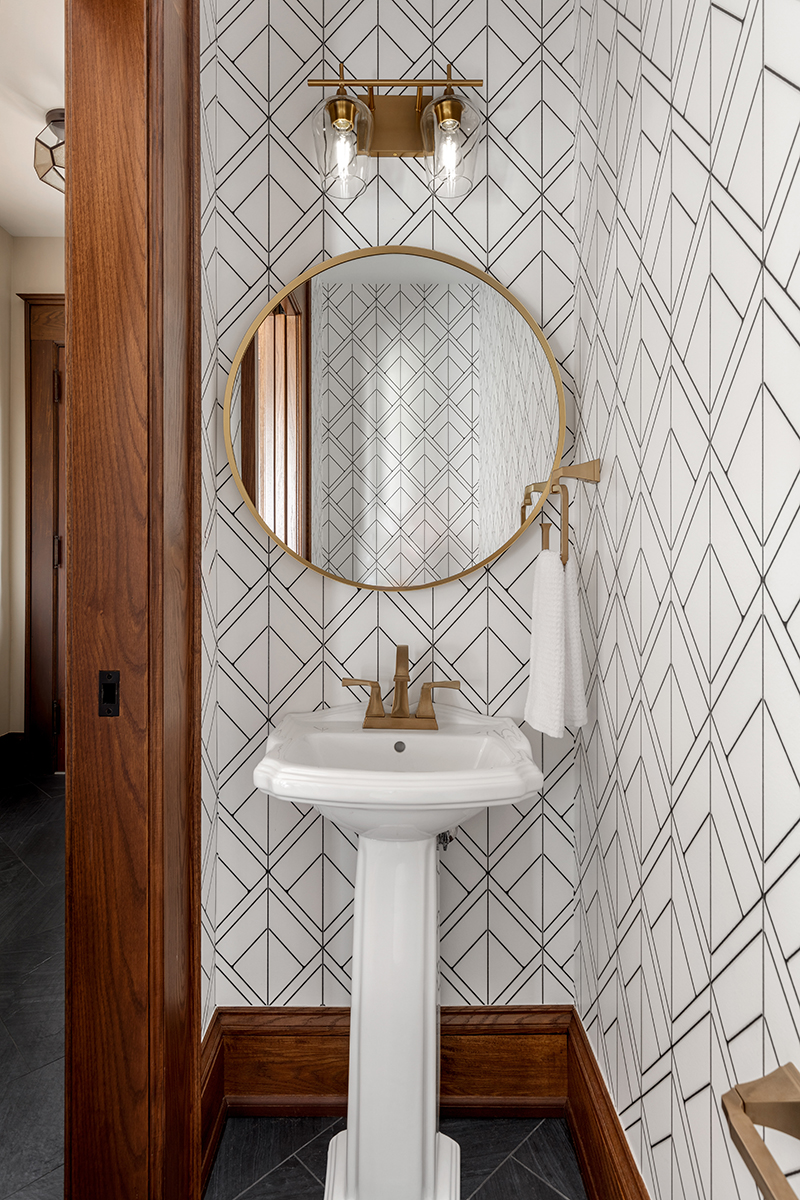
Packing a Punch
Because there is only one bathroom on the first floor, it was important for Shannon Tannehill to maintain the powder room, which, previous to the renovation, was located in the kitchen. Borrowing a few inches – literally, since the room is shy of 3’x4′ – from the hallway and adjoining family room, she created a new powder room with just enough room to accommodate a toilet and sink.
“The room is very small, so the biggest challenge was finding things that fit!” she remarks.
As such, a small pedestal sink offers family and friends a place to wash their hands while pocket door access eliminates any door swing clearances. A round mirror juxtaposes against the squared angles on the wallpaper and the tiles on the floor.
“I am a huge fan of wallpaper,” Tannehill relates. “The client found this paper and loved it because it makes a statement without being too colorful. Powder rooms are a great place to do something fun. It’s a small room that packs a real punch!”
link

:max_bytes(150000):strip_icc()/GettyImages-544347092-69d2e73c38f345a7baa16f89d6570186.jpg "This Kitchen Countertop Style Is So 2010s")


