Mid-century Modern Meets Scandinavian – Kitchen & Bath Design News

SALT LAKE CITY — Ashley Walsh lives in Arizona. Maddy DeVries lives in North Carolina. With home bases thousands of miles apart, they have had to perfect their ability to work virtually to successfully run their business, Morgan Design Studio, aptly named for their shared middle name. Fortunately, mastering ‘remote’ also gives them the familiarity and expertise to help clients who not only live in their respective states, but also those who live elsewhere across the country.
So, when these clients’ realtor reached out to the design duo with a request to help their Salt Lake City, UT client, Walsh and DeVries didn’t hesitate to delve in.
“Most of our projects aren’t actually located in our home states,” notes Walsh. “We work all over the country, including Salt Lake City, where we have been fortunate enough to have had a couple of projects.”
“This project was designed fully remote,” adds DeVries. “Our clients really trusted us in the design process. We also had a contractor who followed our finish schedules, elevations and renderings really well. Any questions that came up, we were able to answer via Facetime, phone call or text.”


Like designers who work closer to their homes, the entire renovation process began with discussions about what the client wanted.
“These clients are two young professionals who both work in the medical field,” explains Walsh. “Plus, they have two kids under the age of five. They wanted their home to look elevated, but also be durable for daily living with two small children.”
To start, they entirely reworked the layout, enlarging the kitchen by extending it into the previous eat-in area. They also eliminated a pantry and opened up the adjacent staircase and living and dining rooms.
“The kitchen hadn’t been updated since the home was built, which was in the early ’70s,” offers DeVries. “The lighting was terrible, the kitchen was small and closed off, and the staircase divided the home. Now, the kitchen, the dining room, the entry and the living room are all open and connected to each other. This couple loves to entertain, so it’s nice that guests in one room can still be part of the conversation with those in another room.”
With a larger kitchen, their clients also gained more cabinet space, which was previously in limited supply.
“Now, they probably have more storage than they need, which is a great problem to have!” Walsh quips. “I don’t think she has even filled all of her cabinets yet!”

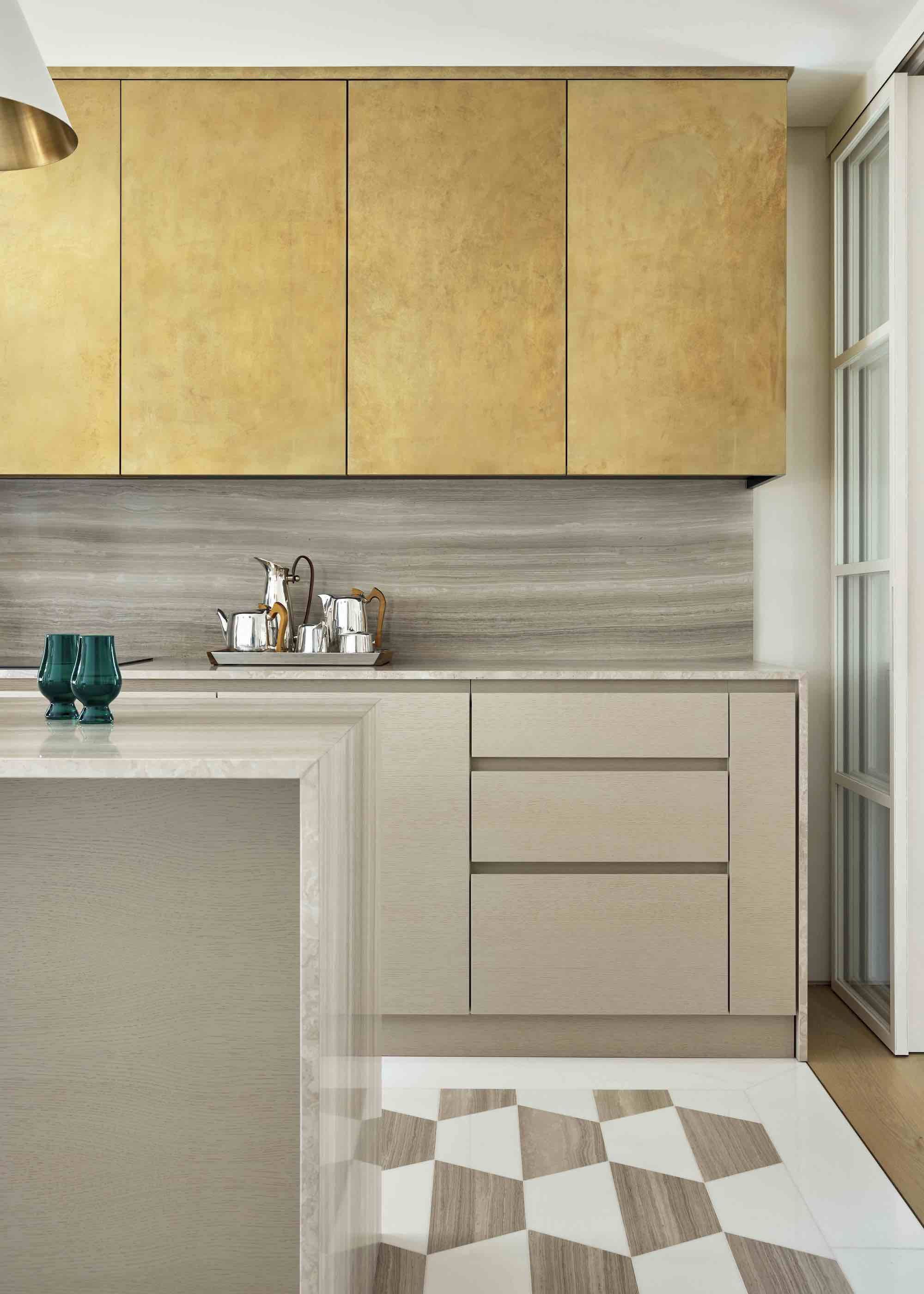
Repeating the porcelain as the backsplash continues the vertical view of the marble-look material. Extending it into a narrow shelf between the cooktop and ventilation hood creates a ‘wow’ factor.

Ashley Walsh and Maddy DeVries entirely reworked the kitchen layout and extended it into the previous eat-in area.
Because the rooms are visible to one another, the designers wanted to create continuity. As such, the custom kitchen cabinetry and built-in storage beneath the television, which wraps around the living room and morphs into bench seating beneath a window, are all clear-finished, knot-free oak. The cabinetry is accented with sleek, Honey Bronze bar-style hardware from Top Knobs. Its gold tone matches the Brizo Luxe Gold faucet at the Delta Faucet workstation sink.
“The home was built during what is considered mid-century, but it didn’t really have much of the expected original architectural charm of the time period,” Walsh relates. “But our clients did want to give a nod to the era. They also love the simplicity and natural color palette of Scandinavian design, which often brings a design back to the basics and pairs it down to what is most important. We felt that oak was a way to merge both aesthetics. Also, using a thin shaker detail, instead of a standard 2″ detail, gives the cabinetry a modern feel with a bit more sophistication than a flat panel.”
Durable focal point
The homeowners also wanted durable finishes, thus the incorporation of the Bedrosians Magnifica Encore Calacatta Macchia Vecchia porcelain countertops and backsplash. The material’s heavy veining delivers an elevated touch, which the designers contrasted with a honed finish that creates a more casual, lived-in aesthetic that resonates with the home’s mid-century design principles.
“Our clients were drawn to the look of marble, but its cost and lack of durability made it impractical for their home,” DeVries explains. “With their two young kids, they use their kitchen every day, so it was important for us to design a space that aligns with their aesthetic but also suits their dynamic lifestyle.”
Given the porcelain’s resemblance to marble, the ‘stone’ also becomes a focal point for the space, particularly on the island where its waterfall edges garner attention.
“When our clients walk into their home, the kitchen is slightly off to the right,” Walsh indicates. “We included waterfall edges on the island so they would see the beautiful ‘stone’ as soon as they walk in. The decision to incorporate the detail was crucial to the overall design, adding both depth and subtle contrast. Had the island been paneled, it would have fallen flat and disappeared with the cabinetry behind it. The waterfall edge also allows them to see the beautiful veining from all angles.”


The requested coffee station was moved from its original designation to an area between the kitchen and dining room, which allowed for the creation of a built-in planter for the husband’s plants to fill the space.
To continue a vertical view of the porcelain, the designers repeated it as the backsplash around the kitchen’s perimeter, extending it into a narrow shelf between the cooktop and ventilation hood to create a standout feature.
“It creates a ‘bookmark’ moment for the kitchen that adds a ‘wow’ factor without overwhelming the space,” says DeVries. “Also, using the same material for the island, perimeter and backsplash allows the material to speak for itself, rather than forcing it to compete with other materials.”
While the porcelain certainly stands out, it isn’t alone in creating the desired aesthetic for the kitchen.
“The finishes we paired with the porcelain tie everything together,” Walsh relates. “For instance, the white oak cabinetry complements the warm veining in the countertop and backsplash while the hardware and ventilation hood surround, which is deliberately simple, contribute to the refined, modern feel. The hood is a key component in the kitchen’s fresh aesthetic where its plaster finish allows a moment for your eyes to rest. Extending it to the ceiling also creates a sense of balance across the visual planes so that no one element overpowers another.”


Walsh and DeVries wanted to create continuity between the kitchen and living room, so the custom kitchen cabinetry and built-in storage beneath the TV – which wraps around the living room and morphs into bench seating beneath a window – are all clear-finished, knot-free oak.
Kitchen accessories
While much of the renovation project was executed seamlessly, even with its designers living remotely, there was one hiccup that required a reassessment. Originally the coffee station was positioned by the staircase so it would meld with the kitchen. However, it had to be moved when it was discovered that a measurement that had been provided to them had been taken incorrectly, which didn’t leave enough room for a walkway between it and the island.
“Our clients wanted a coffee station so we designed this custom, furniture-style piece that matches the kitchen cabinetry,” indicates DeVries. “But when we discovered that it wouldn’t fit, we reworked the layout and moved it to an area between the kitchen and dining room. In the end, it actually worked out perfectly because it carries the kitchen cabinetry closer to the dining room.”
The designers also utilized the coffee station’s original location, turning it into an indoor planter.
“The husband has a green thumb and a ton of plants,” Walsh adds. “We thought this was a great opportunity to create something special for him. It was a happy accident!”


Problem Solving for More Functional Living
From a number of perspectives, most rooms within the home just didn’t suit the new homeowners’ lifestyle. The primary bathroom was no different.
“There was only one sink, and the shower was so tiny and tight our clients couldn’t even lift up their arms,” Ashley Walsh explains.
During the renovation, Walsh and her design partner, Maddy DeVries, included a much more functional oak vanity with dual Kohler sinks and Brizo faucets set within a Taj Mahal quartzite countertop.
Moving the closet to the bedroom gave the designers space for a much larger shower, which is clad with Bedrosians’ Makoto matte ceramic tile in a mix of Umi Terracotta and Shoji White, the latter of which extends to the walls beyond the shower. Tilebar’s True Terrazzo Sonora Beige tile on the floor gives a nod to the home’s mid-century roots.
“We love how this bathroom came out,” says DeVries. “There is really much more problem-solving that goes into our jobs than most people realize. Design is so much more than just selecting pretty finishes that will look good in the space. It’s really about trying to find a solution for the home that allows it to work in a way that better suits our clients. This bathroom is a great example of that.”
link


:max_bytes(150000):strip_icc()/GettyImages-544347092-69d2e73c38f345a7baa16f89d6570186.jpg)


